

NOVA
Building NOVA's 52,000+ users across the globe, a 'source of truth' destination

Kessel Run
5 Stakeholders
1 Product Manager
1 Developer
1 Designer
My Role: Lead Product Designer
User Interviews, User Flow, Sketching, Wire-framing, Prototyping, User Testing, UI Design, Dev-Design Pairing, Presenting
Design across desktop, tablet, and mobile
The Brief
Who: 52,000+ flying and non-flying Air Force personnel use the PEX app globally on a weekly basis.
What: PEX helps the Air Force manage flying squadrons, scheduling, maintenance, training, safety, and more. PEX had been absorbed into 'NOVA' a suite of applications critical to squadron operations and management.
Air Force personnel using PEX and other NOVA apps didn't have a trusted source to turn to when a NOVA app went down or if it was under maintenance. This gap led to confusion, frustration, and rampant speculation. Our Stakeholders wanted a 'one stop shop' for users to turn to, even when their apps were down.
I collaborated with stakeholders to design and test a 'source of truth' landing page that provides NOVA users with real-time app health status, training resources, announcements, roadmaps, help, and other relevant updates in one centralized location.

Impact
Big takeaway: This will soon be rolled out to NOVA's 52,000+ users around the world
Research
Part 1
My first task was to better understand what our five stakeholders needed. I scheduled and led an ideation exercise to identify themes and map out priorities. I then asked them to dot vote which themes were most important. Their feedback was based on what they had heard from users.

They were then prompted to prioritize themes in a 2x2 grid

Once we identified priorities, I held a follow-up meeting with our Stakeholders to better understand what each entailed. This helped us align on context.
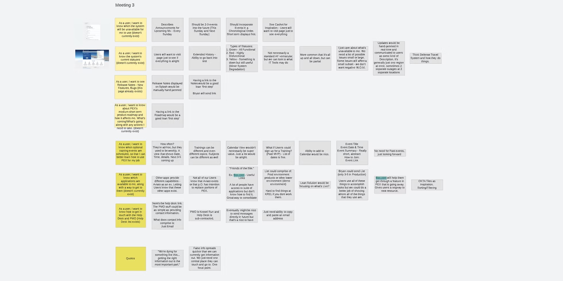
After running these exercises with Stakeholders, a few things became clear. They needed:
Users to know what apps/websites were available for them to use (this wasn't always clear)
A landing page that stayed up, even when a NOVA app went down
A 'source of truth destination' where scheduled and unscheduled maintenance notices could efficiently be communicated.
I synthesized stakeholder feedback into 4 key insights. Users needed:
1
Advanced notice when NOVA products would be under maintenance, so they could adjust their schedule accordingly
2
Real time health statuses of NOVA Products
3
Secure access to all products and services that were available within NOVA.
4
A reliable place for NOVA announcements, trainings, product updates, help information, etc.
“False information spreads quicker than we can currently get information out. We just need one central place they can touch and go to. One focal point.” - Stakeholder
“We're dying for something like this... getting the right information out is the most important part.” - Stakeholder
Design & Testing
Part 2

Once the team was aligned on our goals I began putting pen to paper and mapping up potential designs


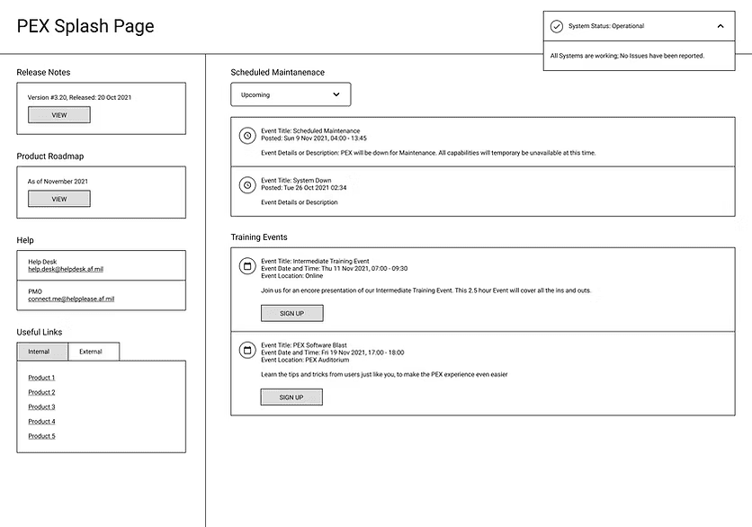
I then conducted a quick feedback session on a pair of low fidelity designs to validate that I was moving in the right direction

Stakeholders felt like initial side panel designs (with Notes, Links, Help, etc.) were too cluttered. Less is more.
They wanted apps and other useful website links more clearly grouped as one 'suite of products.'
They wanted a responsive design, accessible on all devices and for it to be mobile friendly

After various design explorations I set up another stakeholder feedback session, this time with a mid-fidelity prototype.

“Appealing to read, appealing to look at.” - Stakeholder
“Looks really good. Feels familiar.”
- Stakeholder
Stakeholders were happy that the page was easy to navigate and had a simple top to bottom flow.
They liked the hero image section. I included that so users would know the purpose of this new page.
The team agreed that we were ready to build a dummy site to test with users. I worked closely with our Developer to help bring it to life
Product Pillars
The goal was to build something that users could quickly navigate through. The sidebar was designed to expand as new features are added. This will serve as a reliable anchor as users adjust to the page's scope.
Spotlighting the Sidebar
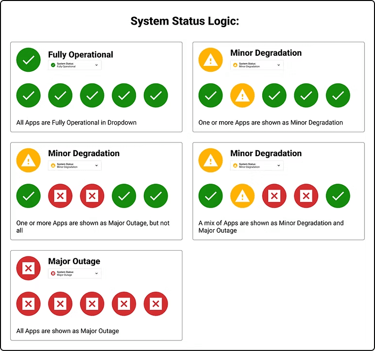
Another key aspect was displaying both a System Status (composite of all app statuses) and individual statuses for each application within the NOVA ecosystem. I worked closely with stakeholders to identify status types, along with when and why each would display. This would provide users a transparent up to date view of the health and availability of this suite of apps. We would refer to these apps as products.
Spotlighting System Status dropdown
There was no pre-established Design System for NOVA's suite of apps. So I created and designed simple responsive components that could easily be repurposed. I then passed off these designs to our developer, who went onto build our testable prototype in just a few days.


“The simplicity of the design is really helpful.” - Developer I paired with
Once we had a working prototype, we scheduled and completed five user tests. I wrote out scripts, tasks to complete, and survey questions to measure. I moderated each user test and recorded each interview. Our Stakeholders helped take notes. One week later, our first round of tests was complete.

Screenshot of testing assets: I used highlighter green and other colors to categorize notes. This made it easier to scan later.

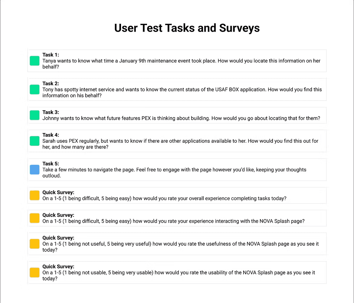
A glimpse at the Tasks and Survey questions I asked users, along with Survey results. We asked users to score our app from 1-5 (5 being the highest) and it scored a 4.5.
“We've never had anything like it [NOVA Splash]. This is going to greatly enhance our communications and presentation to the field...” - User
“Looks really good. Feels familiar.”
- User
“It's user friendly, usable, and well designed." - User
“I feel like it's a pretty good website as it is and it's gonna be pretty useful in the future for us.” - User
Feedback was super positive and users were excited for us to move forward. There were also areas of opportunity:
Some users were thrown off by some of the test's wording.
We used 'maintenance' to mean 'software maintenance,' but they confused it for 'aircraft maintenance.' We made sure to tweak NOVA's copy to clear any confusion.
Additionally, not all users thought of the products as a collective group.
Some felt that the health status of each product should be assigned to its product tile, not the header bar dropdown.
For some Stakeholders, this was their first time sitting in on a User Test. They remarked how 'eye opening' the experience was. It was cool to have such engaged participation.
"I realize that you're pushing this to 52,000 users. They have Operational mindsets, not software mindsets, so it could be confusing if you're talking about maintenance." - User
User testing leads to new perspectives. After reviewing testing feedback, I began to explore some iterations.

Post-testing design explorations of individual Product health statuses

Post-testing design explorations of individual Product health statuses
Shortly after finishing testing, I switched to a different side of the organization to pursue other opportunities. I left the team with these designs:
Demo of Final Version across desktop, tablet, and mobile
Impact
Big takeaway: This will be soon rolled out to PEX's 52,000+ users around the world
Next Up
Athena Case Study
Reimagining Personnel Management